9. June 2026
The Meaning Behind Our Logo and What It Represents in Dental Tourism
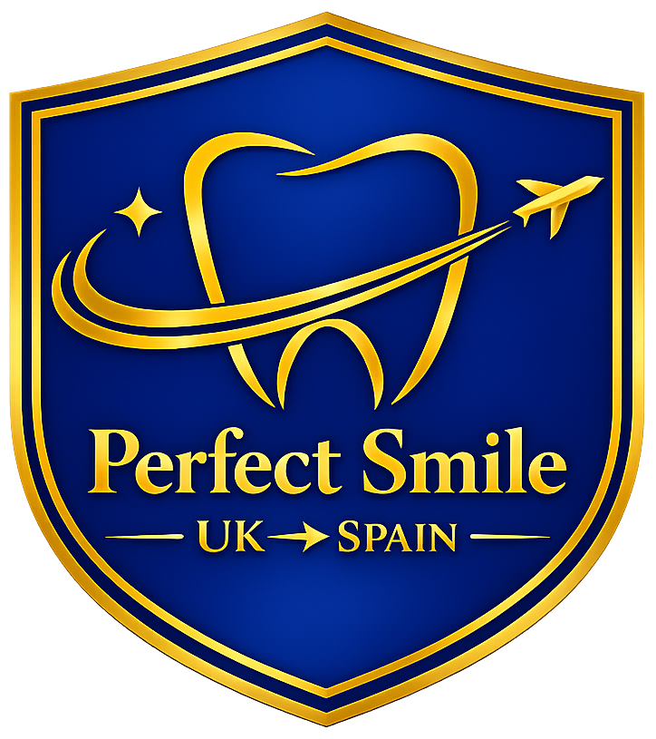
The Story Behind Our Logo
And What It Says About Your Smile Journey
Every brand has a story but a logo is where that story becomes something you can see. When we created the Perfect Smile UK → Spain logo, we didn’t just want something that looked professional. We wanted a symbol that captured the entire journey our patients take: from uncertainty to confidence, from high UK prices to accessible world‑class treatment, from hesitation to a brand‑new smile. And that’s exactly what this logo represents.
The Tooth: A Promise of Clinical Quality
At the centre of the logo is a clean, elegant tooth outline. It’s simple deliberately so because dental care shouldn’t feel complicated or intimidating. The tooth represents, 1) Clinical excellence, 2) High standards of hygiene and safety and 3) a focus on long‑term oral health, not quick fixes. It’s a reminder that behind every smile transformation is a team of skilled professionals who care about doing things properly.
The Orbit Line: Your Journey, Simplified
The sweeping line around the tooth is more than a design element it’s the story of your journey. It symbolises: 1) Movement from the UK to Spain, 2) a smooth, guided process, 3) support wrapped around you at every stage. Dental tourism can feel overwhelming. This line represents the reassurance that you’re not doing it alone.
The Airplane: Confidence to Travel for Better Care
The small airplane is subtle but powerful. It reflects: 1) Your decision to explore better options abroad 2) The freedom to choose quality and affordability 3) A journey that leads to a life‑changing result. It’s not about “cheap treatment abroad.” It’s about smart choices, trusted clinics, and a supported experience.
The Sparkle: The Moment Everything Changes
That tiny sparkle near the tooth? That’s the moment our patients talk about most the moment they look in the mirror and see a smile they haven’t seen in years. It represents: 1) Renewed confidence 2) A fresh start 3) A smile that finally feels like “you” again. It's a small, but meaningful just like the detail's that matter in great dentistry.
The Shield: Protection, Trust, and Safety
The shield shape is intentional. It communicates protection, trust, and safety the foundations of everything we do. It stands for: 1) Your safety throughout the journey 2) Clinics we personally know and trust 3) A UK team supporting you from home. Because choosing treatment abroad shouldn't feel risky it should feel supported.
The Colours: Calm, Premium, Reassuring
The deep blue and gold palette was chosen to reflect: 1) Professionalism and trust 2) Premium service without premium pressure 3) Warmth and reassurance. It's a visual promise that you're in safe hands.
What Our Logo Really Means
When you put all the elements together, the message is simple: You’re supported, you’re safe, and you’re choosing a smarter way to transform your smile. Our logo isn’t just a design. It’s a commitment to transparency, to care, and to giving people access to world‑class dentistry without the barriers they face in the UK.